Washington State University Design Student

Washington State University Design Student

Friday, December 17, 2010

Revit Project


For this Revit project I took the residential project that I finished earlier this year and created the same house using Revit. This helped to improve my Revit skills and gave me better perspectives of what the exterior view of my house would look like.

The Monroe Cafe

For this project we were asked to design a cafe in the South Campus Facility. I began by choosing the Monroe St. Bridge as my inspiration piece. We were then asked to create a pattern from our inpiration piece and turn it into a partition to be used in the space. The bridge has Art Deco influences so I carried this out in my design. This is the furniture floor plan that I came up with based on my concept, the amount of space we were given, and the research about third places.


Here is an overall view of the main dining area of my cafe. The partitions seen here are based on the pattern created from my inspiration piece. This view also helps to show the overall volumn of the large space.


This elevation shows one of the seating areas in my cafe.


This view is from inside of the cafe looking out into the surrounding area to get a better undestanding of how my design works in the space that was given to us.


Here is detailed elevation of the service area in the cafe to better show how it would function.
The annotations point out important details of the space.


This is the same view as above only in a perspective to show how the entire service area works and how the dropped ceiling and lighting interact with the space.


Overall in this project I further developed my drafting and rendering skills. It also helped me to learn codes of a public space such as ADA regulations and fire protection codes. The space has a very large volumn so I had to consider all aspects of the design and how they would work in one large open space. I also learned how to take research we had done in the field and apply it to my design to make it function better.


Friday, October 29, 2010

Crane Residence

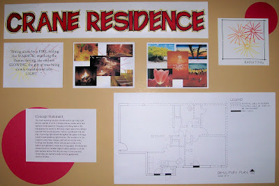
Here is the final presentation for the Crane Residence. I began by choosing a quote and then finding images which represent what the quote means to me. From this I created a parti drawing and came up with a concept word- Radiating. From this word I was able to write my concept statement and base my entire design. By going through this process I developed skills in the design process. 
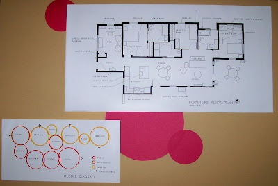
Based on my concept, I was then able to create a floor plan taking into considerations all the client needs and wants. A space analysis and bubble diagram helped me work out an effective floor plan.
From the floor plan, I then drew out elevations and perspectives to see how the space will look and feel in a more three dimensional form. I then picked materials and finishes for each space. Doing this helped me learn the requirements for ADA and universal design and also helped my hand drafting and rendering skills.


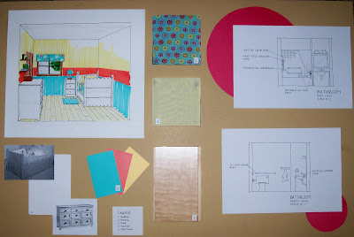
Each space had different elements that I needed to consider especially because one of the clients is in a wheel chair. This improved my skills of being able to think about many details at once and how one element may affect another.


Sunday, October 10, 2010

Full Room Rendering

Here is a complete room rendering done by using all the skills previously learned. The drawing uses Good Graphics such as professional dot and gap, free hand line, and hit-go-hit. In the rendering I used plane change, color mixing, and white space to achieve a realistic space. Although my skills are improving I still need to work on mixing colors and creating shadows in the space. My goal is to keep working on these skills to create renderings that show the space I have designed clearly as well as artisticly.

Lettering and Rendering

This images show both lettering and rendering techniques. The hand drafted letters are easy to read and are given some visual interest the colors. These skills are important so that your ideas come across clearly and are easy to read. The lettering could use some work making the letters uniform and all the same thickness. The rendering improved my skills of blending the markers and creating value change through a number of different techniques.

Rendering Techniques


These two images represent some of my first attempts at rendering. The bottom photo shows different ways of mixing colors and value change. These techniques are used in the top photo of the chair to show plane change and shadow. My rendering skills can definitely be improved upon but doing exercises like these is helping me to better my skills.

Thursday, July 29, 2010

Final Presentation Boards


These are the final presentation boards for A Place of My Own created in Indesign. They include a revised floor plan, reflected ceiling plan, two elevations, two perspectives, and concept work.

Photoshop Quilt

For this assignment we were asked to create one piece of the quilt block in photoshop (upper left) and then mimic it in marker (upper right), colored pencil (lower right), and a combination of the two (lower left).

Sunday, July 25, 2010

Material Board


This is part of the material board created for my concept presentation. It displays the overall feeling and color scheme for the space as well as some materials that will be used.

Floor Plan and Reflected Ceiling Plan


These are the plans that were used for our concept presentation. It is a studio apartment that we made into a place of our own using the concept statement developed earlier.

Elevations and Perspectives


After drawing our floor plan we then made two elevations and one perspective to better show our space.

Concept work


For our conceppt work we created a adjacenty matrix, criteria matrix, bubble diagram, an blocking diagram.

Model

From our quote sketches we created a 3D model out of chipboard to go along with our concept statement. We then went to the daylighting lab to see how light would affect our models and what kind of shadow they would cast.

Concept from Quotes


We choose four sketches from the last assignment to refine and develop into a concept statement for a place of our own.

Parti Sketches


As a class, we read the novel "A place of My Own" by Michael Pollen. Each of us then picked four quotes that spoke to us and that we thought would be a good jumping off point to our room concept. For each quote we drew six abstract sketches and labeled them with the elements and principles of design.

Monday, July 12, 2010

Attempting CAD

In this first attempt at using CAD we first measured out the bathroom and then hand drafted it. We then used these measurements and drawings to create the bathroom in CAD trying out all the different tools and just getting a feel for the program.

Thursday, July 1, 2010

Color Harmony


This assignment demonstrates the correct identification and definition of color harmonies, matching of colors, correct labeling, craftsmanship, and composition.

Rendering Techniques

Using a tracing to practice using a combination of markers, blending, and colored pencils.

Lettering


Demonstration of hand lettering.

Tuesday, June 29, 2010

Elements and Principles of Design


For this assignment we were asked to create two posters, one for the elements of design and one for the principles of design. Each element and principle needed to have a picture that represented it with a description, its definition, and a sentence that used the word. These photos were taken around campus and downtown Spokane. The definitions were revised from the book Interior Design Illustrated by Francis D.K. Ching and Corky Binggeli.

Thursday, June 24, 2010