Washington State University Design Student

Washington State University Design Student

Thursday, July 29, 2010

Final Presentation Boards


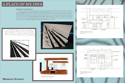
These are the final presentation boards for A Place of My Own created in Indesign. They include a revised floor plan, reflected ceiling plan, two elevations, two perspectives, and concept work.

Photoshop Quilt

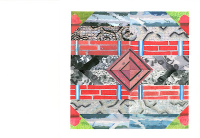
For this assignment we were asked to create one piece of the quilt block in photoshop (upper left) and then mimic it in marker (upper right), colored pencil (lower right), and a combination of the two (lower left).

Sunday, July 25, 2010

Material Board


This is part of the material board created for my concept presentation. It displays the overall feeling and color scheme for the space as well as some materials that will be used.

Floor Plan and Reflected Ceiling Plan


These are the plans that were used for our concept presentation. It is a studio apartment that we made into a place of our own using the concept statement developed earlier.

Elevations and Perspectives


After drawing our floor plan we then made two elevations and one perspective to better show our space.

Concept work


For our conceppt work we created a adjacenty matrix, criteria matrix, bubble diagram, an blocking diagram.

Model

From our quote sketches we created a 3D model out of chipboard to go along with our concept statement. We then went to the daylighting lab to see how light would affect our models and what kind of shadow they would cast.

Concept from Quotes


We choose four sketches from the last assignment to refine and develop into a concept statement for a place of our own.

Parti Sketches


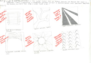
As a class, we read the novel "A place of My Own" by Michael Pollen. Each of us then picked four quotes that spoke to us and that we thought would be a good jumping off point to our room concept. For each quote we drew six abstract sketches and labeled them with the elements and principles of design.

Monday, July 12, 2010

Attempting CAD

In this first attempt at using CAD we first measured out the bathroom and then hand drafted it. We then used these measurements and drawings to create the bathroom in CAD trying out all the different tools and just getting a feel for the program.

Thursday, July 1, 2010

Color Harmony


This assignment demonstrates the correct identification and definition of color harmonies, matching of colors, correct labeling, craftsmanship, and composition.

Rendering Techniques

Using a tracing to practice using a combination of markers, blending, and colored pencils.

Lettering


Demonstration of hand lettering.